15 Principles Of Good Web Design
Good web design adheres to fundamental principles that elevate user experience and aesthetic appeal. Clarity and simplicity guide users through an intuitive journey, ensuring easy navigation and comprehension. Consistent branding, from logos to color schemes, establishes a cohesive identity that resonates. Prioritizing readability through thoughtful typography choices enhances content accessibility. Strategic use of white space prevents visual clutter, maintaining a clean and focused design. Responsive design guarantees seamless functionality across diverse devices, accommodating various screen sizes. Engaging visuals, balanced with purposeful content, captivate users and convey information effectively. Integration of user feedback and continuous testing ensures ongoing refinement, aligning the design with evolving user preferences and technological advancements.
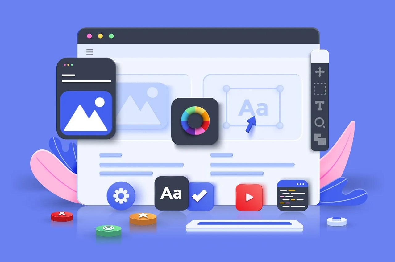
Creating a visually appealing and user-friendly website involves adhering to principles of good web design. Here are 15 key principles to consider:
- User-Centric Design:
- Prioritize the needs and preferences of your target audience.
- Understand user behaviors and tailor the design to enhance the overall user experience.
- Responsive Design:
- Ensure that your website is accessible and functions well across various devices and screen sizes.
- Utilize responsive design techniques to adapt content seamlessly to different resolutions.
- Clear Navigation:
- Design an intuitive navigation structure that helps users easily find the information they’re looking for.
- Use clear and concise labels for navigation elements.
- Consistent Branding:
- Maintain a consistent visual identity that aligns with your brand.
- Use consistent colors, fonts, and imagery to reinforce brand recognition.
- Readability and Legibility:
- Choose readable fonts and font sizes to enhance text clarity.
- Ensure sufficient contrast between text and background colors for easy reading.
- Visual Hierarchy:
- Organize content with a clear visual hierarchy to guide users through the page.
- Use headings, subheadings, and visual cues to emphasize important information.
- Whitespace Utilization:
- Incorporate ample whitespace around elements to prevent visual clutter.
- Allow for breathing space between text, images, and interactive elements.
- Loading Speed Optimization:
- Optimize images and code to improve website loading times.
- Consider implementing lazy loading for images to enhance performance.
- Mobile-Friendly Design:
- Design for mobile-first to ensure a seamless experience on smartphones and tablets.
- Test and optimize the mobile version for usability and performance.
- Interactive Elements:
- Implement interactive elements, such as buttons, forms, and sliders, for user engagement.
- Ensure that interactive elements provide feedback to users.
- Accessibility:
- Design with accessibility in mind, adhering to WCAG guidelines.
- Provide alternative text for images, use semantic HTML, and ensure keyboard navigation.
- Cross-Browser Compatibility:
- Test your website across different browsers to ensure consistent functionality.
- Address any compatibility issues that may arise on specific browsers.
- Scannable Content:
- Break content into digestible sections with clear headings and subheadings.
- Use bullet points and short paragraphs to make content easy to scan.
- Call-to-Action (CTA):
- Strategically place CTAs to guide users toward desired actions.
- Use compelling language and design to make CTAs stand out.
- Feedback and Iteration:
- Collect user feedback through surveys, analytics, and usability testing.
- Continuously iterate and improve the design based on user insights and changing trends.
By incorporating these principles into your web design process, you can create a website that not only looks visually appealing but also delivers a positive and effective user experience.