15 Principles Of Good Web Design
Good web design adheres to fundamental principles that elevate user experience and aesthetic appeal. Clarity and simplicity guide users through an intuitive journey.
Web design encompasses the art and science of creating visually appealing and functional websites. It involves a creative blend of graphic design, user experience (UX) design, and technical expertise to deliver a seamless online experience. A well-designed website considers the client's objectives, target audience, and industry trends. Responsive design ensures compatibility across various devices, while strategic use of colors, typography, and imagery enhances brand identity. User-friendly navigation and intuitive layouts optimize the overall user experience.
Crafting stunning websites, our web design agency blends creativity and technology to deliver impactful online experiences that captivate and engage.
Explore our web design case studies for insights into client challenges, innovative solutions, and successful outcomes, showcasing our expertise and creativity.
Curvearro Web design guide : define goals, understand audience, prioritize responsiveness, optimize for SEO, and embrace user-centric principles for success.
Elevate your online presence with our web design services : custom designs, responsive layouts, SEO integration, and user-centric solutions for impactful experiences.
Web design involves creating and structuring the visual elements of a website. It includes layout, color schemes, graphics, fonts, and interactive features to ensure an aesthetically pleasing and user-friendly online presence. Effective web design considers both visual appeal and functionality, aiming to provide a seamless user experience across devices. It also involves understanding user behavior, implementing responsive design for mobile compatibility, and optimizing for search engines. Web designers use coding languages like HTML, CSS, and JavaScript to bring the visual aspects to life. A well-designed website is crucial for businesses, organizations, or individuals to establish credibility, engage visitors, and achieve their online goals.
Web design encompasses the process of creating and arranging elements on a web page to produce a visually appealing and functional interface. It involves the use of various design principles, technologies, and tools to achieve an effective and user-friendly website. Web design covers both the aesthetic aspects, such as layout and color schemes, as well as the functional elements, including navigation and user interaction.
In the digital age, a strong online presence is crucial for businesses, organizations, and individuals. Web design plays a vital role in establishing and maintaining this presence. A well-designed website not only attracts visitors but also engages them, encouraging longer stays and repeat visits. The user experience (UX) provided by a website is a key factor in shaping the perception of a brand or entity, influencing its credibility and trustworthiness.
Effective web design takes into account the target audience, ensuring that the website meets their needs and expectations. A responsive and mobile-friendly design is essential, considering the widespread use of smartphones and tablets for browsing. Additionally, search engine optimization (SEO) is closely tied to web design, as search engines favor well-structured and accessible websites in their rankings.
The field of web design has undergone significant evolution since the early days of the internet. Initially, websites were simple and primarily focused on delivering information. As technology advanced, so did the capabilities of web design. The advent of CSS (Cascading Style Sheets) allowed for more sophisticated and flexible layouts, while the integration of multimedia elements, such as images and videos, enhanced the visual appeal.
The rise of mobile devices in the 21st century led to the adoption of responsive design practices, ensuring websites adapt seamlessly to various screen sizes. The shift towards user-centric design brought a greater emphasis on UX, with designers prioritizing usability, accessibility, and overall user satisfaction.
Web design has also been influenced by trends in graphic design, technology, and user behavior. From flat design to parallax scrolling, designers continue to explore new techniques to create innovative and engaging web experiences. As technologies like artificial intelligence and virtual reality advance, the future of web design holds the promise of even more immersive and personalized online interactions.
User-centric design, also known as user-centered design, revolves around prioritizing the needs and preferences of the end-users throughout the design process. This principle involves understanding the target audience, conducting user research, and creating interfaces that are intuitive and easy to navigate. By focusing on the user experience (UX), designers aim to enhance user satisfaction, engagement, and overall usability of the website.
Web accessibility ensures that all individuals, regardless of disabilities or impairments, can access and interact with a website effectively. Designers follow accessibility guidelines, such as those outlined by the Web Content Accessibility Guidelines (WCAG), to create inclusive web experiences. This involves considerations for users with visual, auditory, motor, or cognitive impairments, ensuring that everyone can perceive, understand, navigate, and interact with the content.
With the increasing diversity of devices used for web browsing, responsive design has become a fundamental principle. Responsive design involves creating websites that adapt seamlessly to different screen sizes and resolutions, providing an optimal viewing experience across desktops, laptops, tablets, and smartphones. This approach involves flexible grid layouts, fluid images, and media queries to adjust the presentation of content based on the device’s characteristics.
Visual hierarchy is the arrangement and prioritization of elements on a web page to guide users through the content in a meaningful way. It involves using various design elements such as color, contrast, size, and spacing to emphasize important information and create a clear flow. Additionally, ensuring readability is essential, involving the use of legible fonts, appropriate font sizes, and well-structured text to enhance the user’s ability to consume and understand the content easily.
Consistency in branding and messaging is crucial for building a recognizable and trustworthy online presence. Designers should maintain a cohesive visual identity, including the use of consistent colors, fonts, and imagery, to reinforce brand recognition. Consistency in messaging involves aligning the content and tone with the brand’s values and goals, fostering a unified and coherent communication strategy across the website.
Adhering to these core principles contributes to the creation of effective, user-friendly, and visually appealing websites that cater to diverse audiences and devices, ultimately enhancing the overall success of a digital presence.
Layout and grid systems form the structural foundation of web design. A well-thought-out layout organizes content in a visually pleasing and logical manner, facilitating user navigation. Grid systems provide a framework for arranging elements on a page, helping designers maintain consistency and alignment. Responsive design principles often involve the use of flexible grid systems to ensure a seamless experience across various devices.
Color plays a significant role in conveying mood, establishing brand identity, and guiding user attention. Web designers utilize color theory to choose palettes that evoke the desired emotions and enhance the overall aesthetic appeal. Careful consideration of contrast, complementary colors, and color psychology helps create visually engaging and harmonious designs. Accessibility guidelines also emphasize the importance of color contrast for users with visual impairments.
Typography influences the readability and visual impact of a website’s content. Designers select fonts that align with the brand identity and enhance the overall design. Considerations include font style, size, line spacing, and hierarchy to create a clear and organized text layout. Web fonts and typography principles contribute to a cohesive design while ensuring legibility across different devices and screen sizes.
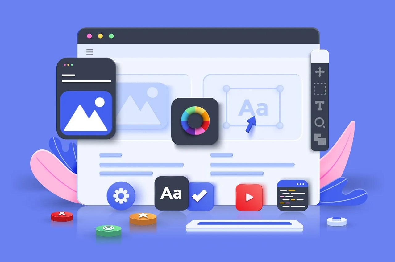
Images and visual elements are essential for conveying information, enhancing engagement, and creating a visually appealing website. High-quality and relevant imagery, such as photographs, illustrations, and infographics, can effectively communicate messages. Consistent image styles and resolutions contribute to a polished design. Web designers also optimize images for faster loading times without compromising quality, considering the impact on user experience.
Icons and graphics serve as visual cues to guide users and represent information in a concise and recognizable manner. Icons can be used for navigation, calls to action, or to highlight key features. Consistent iconography contributes to a cohesive visual language. Graphics, such as illustrations or charts, complement textual content and enhance the overall visual appeal of the website. Both icons and graphics play a crucial role in creating an intuitive and user-friendly interface.
By carefully integrating these elements into the overall design, web designers can create a harmonious and effective user experience, capturing the attention of visitors and conveying information in a visually compelling way.
Adobe Creative Cloud Suite is a comprehensive set of design tools widely used in the creative industry. It includes applications like Adobe Photoshop for image editing, Adobe Illustrator for vector graphics, Adobe XD for user experience and user interface (UX/UI) design, and Adobe Dreamweaver for web development. Designers often use a combination of these tools to create visually appealing and functional websites.
Sketch is a popular vector graphics editor specifically designed for UI and UX design. It offers an intuitive interface and features like artboards, symbols, and plugins that streamline the design process. Sketch is known for its focus on collaboration and responsive design, making it a preferred choice for many web designers, especially those working on Mac platforms.
Figma is a cloud-based design tool that allows real-time collaboration among team members. It is known for its versatility and compatibility across different operating systems, making it a popular choice for remote collaboration. Figma supports UI/UX design, prototyping, and design systems, providing a seamless workflow for designers and developers.
Canva is a user-friendly graphic design tool that caters to a wide range of users, including those with little design experience. It offers pre-designed templates for various purposes, making it easy for individuals and small businesses to create visually appealing graphics and layouts. While not as robust as some professional design tools, Canva is accessible and useful for quick and simple design projects.
WordPress is a popular content management system (CMS) that powers a significant portion of the internet. It allows users to create and manage websites without extensive coding knowledge. WordPress offers a range of themes and plugins, enabling users to customize their websites easily. Additionally, website builders like Wix, Squarespace, and Weebly provide drag-and-drop interfaces for building websites, making them accessible to individuals and small businesses with limited technical expertise.
These tools cater to different aspects of the web design process, from creating graphics and layouts to managing content and building websites. Designers often choose tools based on their specific needs, preferences, and the complexity of the project at hand.
Before embarking on the web design process, it’s crucial to clearly define the goals and objectives of the website. Whether the aim is to sell products, provide information, generate leads, or promote a brand, having a clear understanding of the purpose will guide the design decisions. Goals should be specific, measurable, achievable, relevant, and time-bound (SMART) to ensure a focused and effective design strategy.
Understanding the target audience is fundamental to creating a website that resonates with users. Consider demographics, preferences, behaviors, and needs of the intended audience. This information informs design choices, such as color schemes, typography, and content strategy, ensuring that the website aligns with the expectations of its users.
Analyzing competitors’ websites provides valuable insights into industry standards, trends, and potential opportunities for differentiation. Identify strengths and weaknesses in competitor designs, examine their user experience, and consider how your website can stand out. This analysis helps in positioning your website effectively within the competitive landscape and ensures that your design is informed by industry best practices.
Wireframing involves creating a basic visual representation of the website’s layout and structure, outlining the placement of key elements such as navigation, content sections, and calls to action. It serves as a blueprint for the design and helps in visualizing the overall user flow. Prototyping takes wireframes a step further by adding interactivity and functionality. Prototypes allow stakeholders to experience the navigation and interaction elements before the actual development, facilitating feedback and adjustments early in the process.
These planning steps set the foundation for a successful web design project. By defining goals, understanding the target audience, analyzing competitors, and creating wireframes and prototypes, designers ensure that the subsequent design and development phases are guided by a strategic vision that aligns with the objectives of the website.
Understanding user journeys involves mapping out the paths that users take while interacting with a website or application. This includes their entry points, actions, and potential exit points. By analyzing user journeys, designers gain insights into user behavior and can optimize the design to facilitate a seamless and intuitive experience. This understanding helps in identifying pain points, optimizing key touchpoints, and ensuring a user-centric approach throughout the design process.
Information architecture (IA) focuses on organizing and structuring content to enhance accessibility and findability. Designers create a clear and logical hierarchy of information, ensuring that users can easily navigate and locate the content they seek. Effective navigation systems, including menus, breadcrumbs, and search functionality, contribute to a positive user experience. Consistent and intuitive navigation elements help users feel in control and reduce frustration.
Usability testing involves evaluating a website or application by observing how real users interact with it. This process helps identify usability issues, gauge user satisfaction, and collect valuable feedback for improvement. Test scenarios are designed to simulate real-world usage, and users’ interactions are monitored and analyzed. Usability testing can be conducted at various stages of the design process to iteratively enhance the user experience based on user feedback.
User engagement is crucial for the success of a website or application. Designers employ various strategies to enhance engagement, such as compelling and relevant content, clear calls to action (CTAs), and interactive elements. Visual appeal, responsiveness, and performance also contribute to a positive user experience. By analyzing user behavior through tools like analytics, designers can make data-driven decisions to continually optimize and improve user engagement.
In UX design, the focus is on creating an enjoyable, efficient, and meaningful experience for users. Understanding user journeys, optimizing information architecture and navigation, conducting usability testing, and enhancing user engagement contribute to a holistic approach in designing products that meet users’ needs and expectations.
Crafting intuitive interfaces is at the core of user interface (UI) design. Designers aim to create layouts and elements that are easy to understand and navigate, minimizing cognitive load for users. This involves using consistent design patterns, clear labeling, and logical placement of elements. Intuitive interfaces ensure that users can interact with the system without confusion, enhancing the overall user experience.
Interactive elements, such as buttons, forms, and menus, play a crucial role in user interface design. Designers focus on creating visually appealing and functional interactive elements that guide users through the interface. This includes employing visual cues like hover effects, transitions, and animations to provide feedback and indicate the state of interactive elements. Well-designed interactive elements contribute to a more engaging and responsive user experience.
Visual consistency is essential for creating a cohesive and unified user interface. Designers establish a consistent visual language by using the same colors, fonts, and styling across different pages and sections of the website or application. Consistency helps users build mental models of the interface, making it easier for them to navigate and understand the content. It also reinforces brand identity and contributes to a polished overall design.
Feedback and response design involve providing users with clear and timely feedback about their interactions with the interface. This includes visual cues, such as success messages, error notifications, and loading indicators, to inform users about the outcome of their actions. Feedback design enhances user confidence, reduces uncertainty, and contributes to a smooth and responsive user experience.
In UI design, the focus is on creating visually appealing and functional interfaces that facilitate user interactions. By crafting intuitive interfaces, designing interactive elements, maintaining visual consistency, and implementing effective feedback mechanisms, UI designers contribute to the overall success of a product by enhancing usability and user satisfaction.
The importance of mobile-friendly design stems from the widespread use of smartphones and tablets for web browsing. A mobile-friendly website ensures that users can access and navigate content seamlessly on devices of varying screen sizes. With mobile devices accounting for a significant portion of internet traffic, designing for mobile responsiveness is crucial for providing an optimal user experience and reaching a broader audience.
Media queries are CSS rules that enable the adaptation of styles based on the characteristics of the device, such as screen size, resolution, and orientation. Breakpoints are specific points at which the layout of a website is adjusted to accommodate different screen sizes. Designers use media queries and breakpoints to create responsive designs that adapt fluidly to the dimensions of various devices. This approach ensures that the content is presented in an organized and user-friendly manner across a range of screens.
Testing a website across different devices and browsers is a crucial step in responsive web design. Designers and developers need to ensure that the website functions as intended on various platforms and that the user experience remains consistent. This involves testing on smartphones, tablets, laptops, and desktops, as well as across different browsers such as Chrome, Firefox, Safari, and Edge. Testing helps identify and address any issues related to responsiveness and compatibility.
The mobile-first design approach involves designing the mobile version of a website before scaling up to larger screens. This strategy acknowledges the prevalence of mobile users and prioritizes their experience. Starting with a mobile-first approach encourages simplicity and focuses on essential content and functionality. As the design scales up to larger screens, additional features and content can be progressively enhanced. This approach ensures that the core user experience is prioritized, leading to more efficient and user-centric designs.
Responsive web design is essential for adapting to the diverse landscape of devices and ensuring a consistent and accessible user experience. By emphasizing mobile-friendly design, employing media queries and breakpoints, testing across devices and browsers, and adopting a mobile-first design approach, designers can create websites that effectively meet the needs of users across various platforms.
Web accessibility is the practice of ensuring that websites and web applications are designed and developed to be usable by people of all abilities and disabilities. The importance of web accessibility lies in providing equal access to information and services for everyone, regardless of their physical or cognitive abilities. Accessible design not only enhances the user experience for individuals with disabilities but also improves usability for a broader audience, including those using mobile devices or facing temporary situational challenges.
The Web Content Accessibility Guidelines (WCAG) are a set of internationally recognized guidelines developed by the World Wide Web Consortium (W3C) to ensure web content is accessible to people with disabilities. Designers and developers adhere to these guidelines to create inclusive websites. WCAG outlines principles such as perceivability, operability, understandability, and robustness. Compliance with these guidelines helps make web content accessible to individuals with disabilities, including those with visual, auditory, motor, and cognitive impairments.
Designing for different abilities involves considering a wide range of user needs and providing solutions that accommodate diverse capabilities. This includes:
By considering the needs of users with various abilities during the design process, websites can be more inclusive and accessible to a wider audience.
Several tools are available for testing and ensuring web accessibility compliance. Some commonly used tools include:
These tools aid designers and developers in identifying accessibility issues and making necessary adjustments to enhance the overall accessibility of a website.
By recognizing the importance of web accessibility, adhering to WCAG guidelines, designing for different abilities, and utilizing accessibility testing tools, designers contribute to creating a more inclusive and user-friendly online experience for all users.
Minimalist design is characterized by simplicity, clean lines, and a focus on essential elements. This trend emphasizes a clutter-free interface, with ample white space and a minimalist color palette. Minimalist design aims to enhance user focus, improve readability, and create a visually appealing, uncluttered aesthetic. This trend often incorporates simple navigation and typography, contributing to a modern and sophisticated user experience.
Dark mode is a design trend that offers an alternative color scheme, typically featuring dark backgrounds with light-colored text and elements. Dark mode is not only aesthetically pleasing but also reduces eye strain, especially in low-light conditions. Many websites and applications now include a dark mode option, providing users with a choice for a more comfortable viewing experience.
Microinteractions are subtle, brief animations or responses to user actions that provide feedback and enhance the overall user experience. These small, interactive elements contribute to a sense of responsiveness and engagement. Examples include button animations, hover effects, and notifications that add a layer of interactivity, making the user interface more dynamic and enjoyable.
The use of illustrations and custom graphics has become a prominent trend in web design. Designers are incorporating hand-drawn or digitally created illustrations to add a unique and personalized touch to websites. Custom graphics help brands establish a distinct visual identity, convey complex concepts in a simplified manner, and create a memorable and engaging user experience.
The integration of three-dimensional (3D) elements and parallax scrolling adds depth and interactivity to web design. 3D graphics, animations, and effects create a more immersive experience for users. Parallax scrolling, where background and foreground elements move at different speeds, provides a dynamic and engaging visual effect as users scroll down the page. These trends contribute to a sense of depth, storytelling, and creativity in web design.
Web design trends are constantly evolving, and the adoption of these elements can vary based on the goals, target audience, and industry of a website. Staying aware of current design trends allows designers to incorporate modern and relevant elements while ensuring a user-centric and functional approach to web design.
E-commerce design is crucial for the success of online businesses, as it directly impacts user experience, trust, and conversion rates. An effective e-commerce design not only showcases products attractively but also ensures a seamless and secure shopping experience. The design should facilitate easy navigation, provide clear product information, and instill confidence in users to encourage them to make purchases.
The design of product pages plays a significant role in influencing purchasing decisions. Key considerations for product page design include:
A well-designed product page contributes to a positive user experience and encourages users to move through the purchasing process.
The checkout process is a critical stage where users complete their purchases. To optimize the checkout process:
Optimizing the checkout process reduces cart abandonment and enhances the overall e-commerce experience.
Establishing trust is paramount in e-commerce design. Trust signals and security measures include:
Incorporating trust signals and security measures fosters trust between the e-commerce site and its users, encouraging them to make purchases with confidence.
E-commerce design should prioritize user experience, from the initial product discovery to the final checkout. By focusing on product page layout, optimizing the checkout process, and implementing trust signals and security measures, e-commerce websites can create a user-friendly and trustworthy environment that enhances customer satisfaction and drives business success.
High-converting landing pages are designed with specific elements to encourage visitors to take desired actions. Key elements include:
The design of the call-to-action (CTA) is crucial for prompting user actions. Effective CTA design involves:
A/B testing involves comparing two versions (A and B) of a landing page to determine which performs better in terms of conversion rates. Elements commonly tested include:
A/B testing helps refine landing page elements based on real user data, improving overall performance and conversion rates.
Analytics tools are essential for monitoring and analyzing landing page performance. Key metrics to track include:
Analyzing these metrics provides valuable insights into user behavior, allowing for data-driven adjustments to enhance landing page effectiveness.
By incorporating these elements and practices into landing page design, marketers can create compelling and optimized pages that drive user engagement and conversions. Regular analysis and testing contribute to continuous improvement and increased success in achieving marketing goals.
SEO-friendly URL structures contribute to better search engine visibility and user experience. Key considerations for SEO-friendly URLs include:
Image optimization is essential for SEO, as search engines consider factors such as file size, alt text, and relevance. Best practices for image optimization include:
Schema markup is structured data that provides additional context to search engines, leading to the creation of rich snippets in search results. Incorporating schema markup can enhance search engine visibility and click-through rates. Common types of schema markup include:
Rich snippets offer more informative and visually appealing search results, improving the likelihood of attracting clicks.
Page speed is a critical factor for both user experience and SEO. Core Web Vitals are a set of metrics introduced by Google to measure the overall user experience on a webpage. Key considerations for page speed and Core Web Vitals include:
Google uses Core Web Vitals as a ranking factor, so optimizing for these metrics positively impacts search engine rankings.
By integrating these SEO-focused design practices, web designers can create websites that are not only visually appealing but also optimized for search engines, contributing to improved visibility and ranking in search results.
Consistent branding is crucial for creating a recognizable and memorable online presence. Key elements of consistent branding in web design include:
Consistent branding elements contribute to brand recognition and reinforce the overall identity of the brand.
Color psychology plays a significant role in conveying emotions, messages, and associations tied to a brand. When incorporating color into web design for branding:
Understanding the psychological impact of colors helps designers create a visual experience that resonates with the target audience.
Brand guidelines serve as a reference document that outlines the visual and messaging elements that define a brand. When creating brand guidelines for web design:
Brand guidelines serve as a reference for designers, developers, and content creators to maintain consistency in brand representation.
Building brand identity through design involves creating a visual language that reflects the brand’s personality and values:
By intentionally infusing brand identity into the design, websites become more than functional entities—they become powerful tools for expressing and reinforcing a brand’s essence.
Incorporating consistent branding elements, utilizing color psychology, creating brand guidelines, and building brand identity through design collectively contribute to a strong and cohesive brand presence in the digital space. This consistency enhances brand recognition, trust, and user engagement.
Collaboration between web designers and developers is essential for bringing a design vision to life. Key aspects of working with developers include:
Effective communication with stakeholders ensures that design decisions align with business goals and expectations. Communication strategies include:
Client feedback is integral to refining and improving web designs. Strategies for incorporating client feedback include:
Version control and collaboration tools streamline the design and development process, ensuring everyone is working with the latest assets and information. Key tools and practices include:
By embracing collaborative practices, designers can work more efficiently with developers, communicate effectively with stakeholders, incorporate valuable client feedback, and utilize tools that enhance collaboration and version control throughout the web design process.
Cross-browser testing ensures that a website functions consistently across different web browsers. Key considerations for cross-browser testing include:
User testing involves gathering feedback from real users to identify potential issues and improve the user experience. Strategies for user testing and feedback include:
User testing helps identify areas for improvement based on real user experiences, leading to a more user-friendly design.
Performance testing ensures that a website loads quickly and efficiently under different conditions. Key aspects of performance testing include:
Optimizing performance is crucial for retaining user engagement and improving search engine rankings.
Debugging and troubleshooting are essential for identifying and fixing issues that may arise during the development or testing phases. Key practices for debugging and troubleshooting include:
Regular debugging and troubleshooting practices ensure a more stable and reliable website.
By conducting thorough cross-browser testing, gathering user feedback, performing performance testing, and implementing effective debugging and troubleshooting strategies, web designers and developers can deliver a high-quality website that meets user expectations and performs optimally across different scenarios.
Regularly updating website content is essential for keeping information current and engaging for visitors. Key practices for content updates include:
Regular content updates not only provide value to visitors but also contribute to improved search engine rankings.
Regular security audits and patching are crucial to protect the website from potential vulnerabilities. Key security practices include:
Proactive security measures help safeguard sensitive data and maintain the trust of users.
Monitoring website performance is crucial to identify issues and ensure optimal user experience. Key aspects of performance monitoring include:
Monitoring website performance allows for timely intervention and optimization, ensuring a seamless user experience.
Staying current with design trends is essential to keep the website visually appealing and aligned with user expectations. Strategies for staying current with design trends include:
Adopting current design trends keeps the website modern, engaging, and aligned with evolving user preferences.
Regular maintenance and updates are critical for the longevity and success of a website. By implementing practices such as regular content updates, security audits, performance monitoring, and staying current with design trends, web designers ensure that the website remains functional, secure, and appealing to users over time.
One of the challenges in web design is finding the right balance between creativity and functionality. While a visually appealing design is important, it must also serve the practical needs of the website, such as user navigation and accessibility. Striking the right balance ensures that the website is not only aesthetically pleasing but also user-friendly and effective in achieving its goals.
Designing for diverse audiences poses a challenge, considering the varied preferences, needs, and abilities of users. Factors such as age, cultural background, and technological proficiency can impact how users interact with a website. Web designers must create inclusive designs that cater to a wide range of users, considering accessibility, language, and cultural considerations to provide a positive experience for everyone.
The rapid pace of technological advancements presents a continuous challenge for web designers. New devices, browsers, and technologies emerge, requiring designers to stay updated and adapt their skills and designs accordingly. Keeping up with trends in web development, responsive design, and emerging technologies ensures that websites remain relevant, functional, and compatible with the latest technologies.
Scope creep refers to the gradual expansion of a project’s scope beyond its original requirements. It is a common challenge in web design as clients may request additional features, functionalities, or design changes during the course of a project. Web designers must effectively manage scope creep by clearly defining project scopes, setting expectations, and communicating any changes in timelines or costs that may arise due to additional requests.
Successfully navigating these challenges requires effective communication, ongoing learning, and a proactive approach to problem-solving. Web designers who can find solutions to these challenges contribute to the development of websites that are not only visually appealing but also functional, accessible, and aligned with the needs of diverse audiences.
The integration of artificial intelligence (AI) and machine learning (ML) is expected to play a significant role in the future of web design. AI and ML technologies can be utilized to personalize user experiences, analyze user behavior, and automate various design processes. Chatbots and virtual assistants powered by AI can enhance user interactions, providing more dynamic and personalized website experiences. Machine learning algorithms can also be employed for content recommendation and optimization, contributing to a more tailored and efficient user journey.
Augmented Reality (AR) and Virtual Reality (VR) technologies have the potential to revolutionize the way users interact with web content. The future of web design may see the integration of AR and VR elements, offering immersive and interactive experiences. This could include virtual showrooms for e-commerce, interactive 3D models, and AR overlays that enhance real-world views. Designers will need to explore innovative ways to incorporate these technologies into web interfaces, creating engaging and memorable experiences for users.
As voice-activated devices and virtual assistants become more prevalent, Voice User Interface (VUI) design will become increasingly important. The future of web design may involve optimizing interfaces for voice commands and interactions. Designers will need to consider factors such as natural language processing, voice recognition, and conversational interfaces to create seamless and intuitive experiences for users who prefer voice-based interactions.
With a growing emphasis on environmental sustainability, the future of web design is likely to see increased adoption of sustainable and eco-friendly design practices. This includes optimizing website performance for energy efficiency, reducing carbon footprints, and using eco-friendly hosting solutions. Designers may explore ways to create visually appealing and functional websites while minimizing the environmental impact. Sustainable design practices may extend to the use of renewable resources, efficient coding practices, and the promotion of green hosting options.
The future of web design is dynamic and evolving, with emerging technologies and changing user preferences shaping the landscape. Designers who stay informed about these trends and embrace innovative approaches will be well-positioned to create cutting-edge, user-centric, and environmentally conscious web experiences.
In conclusion, web design is a dynamic field that continues to evolve, driven by technological advancements, changing user behaviors, and emerging design trends. This journey through the various aspects of web design has highlighted the importance of user-centric principles, accessibility, and responsive design. Core principles such as visual hierarchy, consistent branding, and effective use of design elements contribute to creating compelling and functional websites.
As technology progresses, the future of web design holds exciting possibilities, including the integration of AI and machine learning, the incorporation of augmented and virtual reality, and the optimization for voice user interfaces. These trends underscore the importance of staying informed, adapting to emerging technologies, and maintaining a balance between creativity and functionality.
Additionally, the challenges in web design, such as balancing diverse audience needs and addressing scope creep, emphasize the need for effective collaboration, clear communication, and ongoing learning. Web designers play a crucial role in not only creating visually appealing and user-friendly websites but also in addressing security, performance, and environmental considerations.
Looking ahead, the future of web design presents opportunities for innovation, sustainability, and enhanced user experiences. By embracing these opportunities and staying attuned to industry developments, web designers can continue to shape the digital landscape and create impactful online experiences for users around the world.
Whether you’re on your first or 100th campaign. Explore our library of content designed to inspire the future of your brand and optimize your web strategy.

Good web design adheres to fundamental principles that elevate user experience and aesthetic appeal. Clarity and simplicity guide users through an intuitive journey.

Responsive web design, a cornerstone in today's digital landscape, demands careful consideration of best practices.
In the dynamic realm of web design, 2024 unfolds with a tapestry of innovative and inspiring websites that redefine digital aesthetics.
Have a question for our team? Whether you're interested in working with us, need an expert opinion - or just want to find out more about who we are, we'd love to hear from you.
Get in Touch